The imprimatura
A thin wash of colour over the white ground — present before a single brushstroke of the image, and felt in every tone above it.
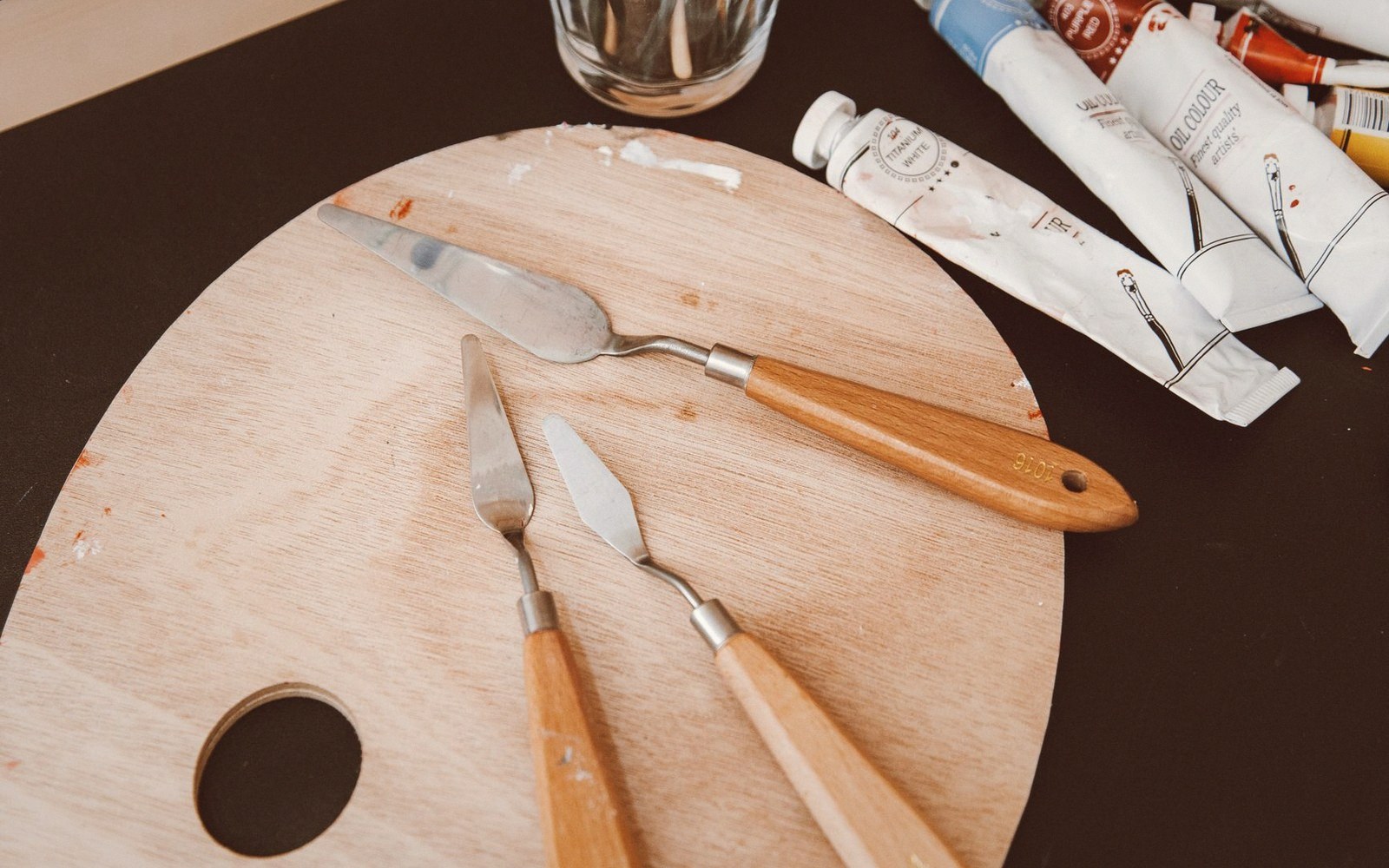
The ground is rigid, brittle with age, and glued to something that moves. That is the whole problem in one sentence.
Photo: ROMAN ODINTSOV / Pexels
One layer that changes everything
The chalk ground is white. That whiteness is intentional: it bounces light back up through the translucent paint layers above it, producing the luminosity Flemish and Dutch panel painters depended on. But white also means cold, blank, and merciless to the hand trying to judge a tone mid-painting. Before the image began, many painters laid down an imprimatura — a thin, semi-transparent wash applied across the whole prepared surface.
The word is Italian but the practice was universal. An imprimatura is not a second ground; it is not opaque, and it does not hide the chalk beneath it. It is closer to a stain — thinned paint, often bound in oil, worked quickly across the surface and partially wiped back, leaving enough pigment to shift the overall key without killing the ground's reflectance. The chalk still does its optical work. The white now has a colour cast.
The typical range in Dutch and Flemish panels runs from warm grey to pale ochre to buff. Those tones were chosen deliberately: they sit close to the mid-value of the final composition, which means the painter could judge lights and darks from the first mark rather than fighting an arbitrary white. Shadows could be left as transparent glazes, letting the imprimatura read as middle tone without further paint. Highlights were added on top. The whole system was faster and more legible than building every passage from scratch over white.
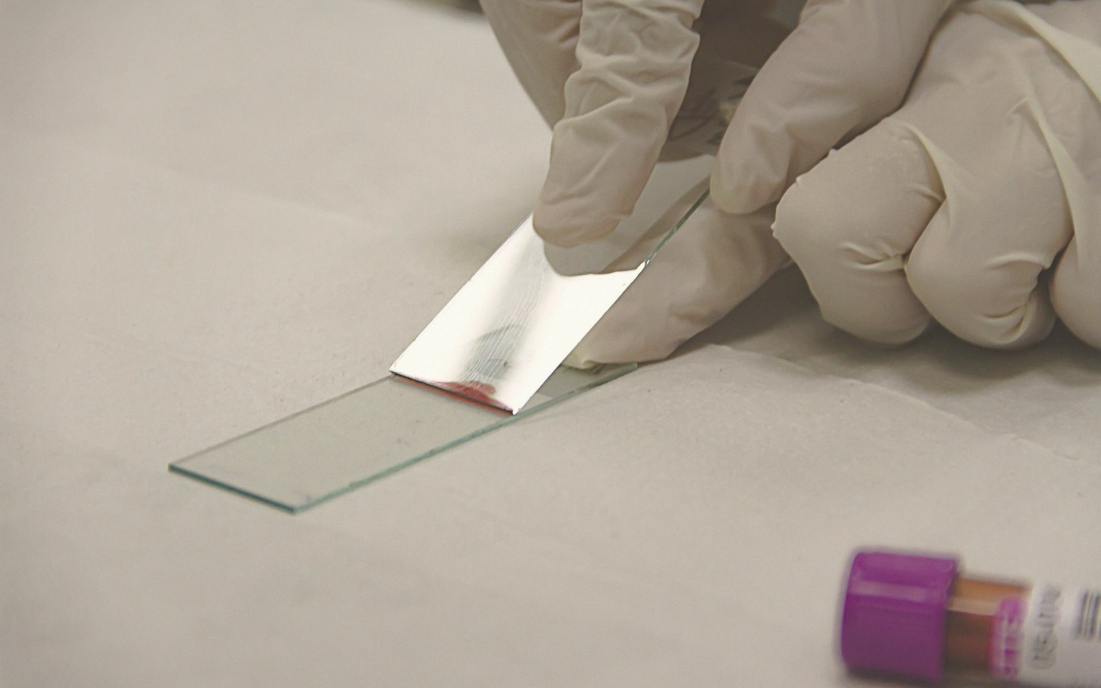
A sample the width of a hair, set in resin and polished, holds the whole build order in view at once.
Photo: roberto carrafa / PexelsFour centuries later, the imprimatura is one of the layers conservators read most carefully. Because it was applied thinly and often contains lead white, ochre, or smalt — all of which age differently — it can shift in hue, add warmth or green the middle tones in ways the painter never intended. When paint above it becomes more transparent with age, the imprimatura's colour bleeds into every area it underlies. It was always part of the image. Now it shows more than it once did.
In glazes built thin over a light ground, the imprimatura is the quiet first voice — the tone the glazes are in conversation with.
That whiteness is intentional: it bounces light back up through the translucent paint layers above it, producing the luminosity Flemish and Dutch panel painters depended on.
How it works optically
Lifted out of the piece| Chalk ground alone | bright white, high reflectance, harsh for tone judgement |
| Imprimatura | thin toned wash, stains without blocking; light still reaches chalk and returns |
| Combined effect | a luminous mid-tone base the painter reads as "neutral" while building image |
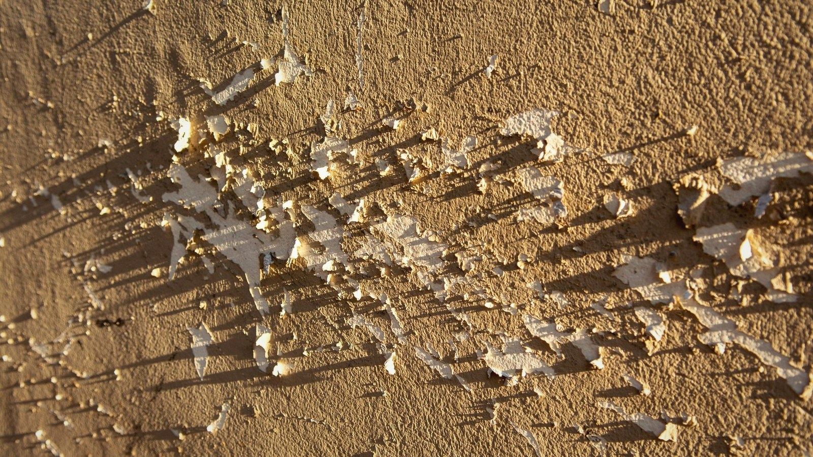
Raking light at a shallow angle turns every deformation in the surface into a shadow — cracks, cupping, and the ridge along a join all read at once.
Photo: Jan van der Wolf / Pexels